

Client
Volt Industry
Services
Visual Design
UI & UX Design
Industries
Travel
Date
January 2023
During the rise of the dreaded Covid 19 Pandemic outbreak many businesses had to pivot their focus to meet the requirements of travelers with a new set of behavioral constraints. I wanted to kick off this project to show how to stay competitive.
I had to be curious as to how the audience was getting ready to face the challenges. Many of the rentals were ready to start the cleaning protocol and adopted all kinds of safety procedures. This problem is urgent for the hotel because they are spending too much time just to do the check-in and check-out process.
I decided to follow IDEO’s Human-Centered Design and Lean UX Design Thinking process to make sure that my design decisions were supported by user research and feedback. I wanted to provide an online self check in and out service to streamline the process
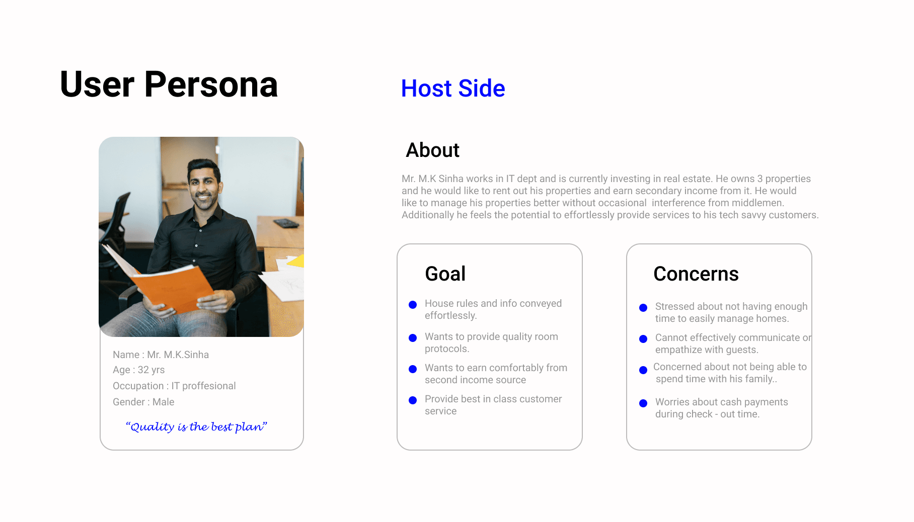
One of the biggest pain points in holiday home rentals is the front desk check-in and check-out experience. The front desk has no control when large groups of people will show up to check-in. What kind of difficulties do users face in the check-in/out process? 1. How much time is usually spent at the counter for both processes? 2. What do you expect to shorten the check-in and check-out process at the hotel? To understand the users I had to create personas. As representative of right user, persona made with their information related goals, frustration and personality . The purpose is to giving solution of their problems.

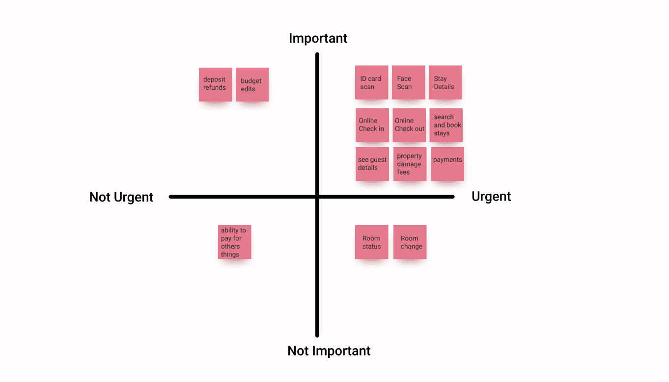
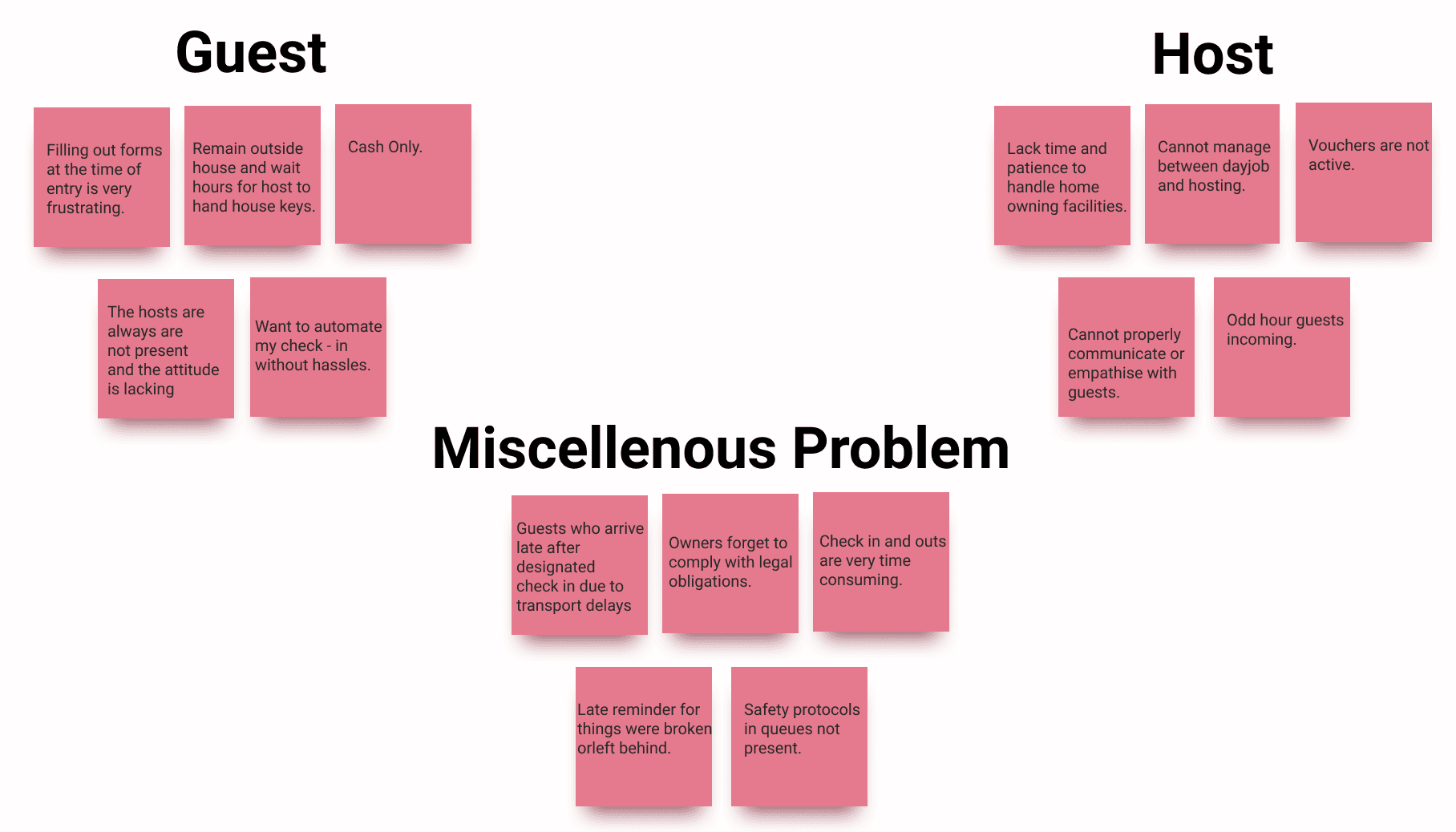
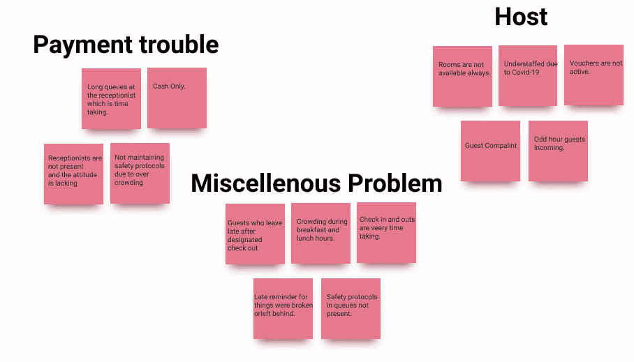
After understanding the basics of User Needs and Frustrations, I quickly plotted out affinity maps to help us synthesize the research data. I divide it into two parts, the check-in, and check-out process. Based on the results of research synthesis , I grouped these ideas into priority quadrants in the form of a 2×2 matrix as shown below. This approach to problem-solving tasks might be very effective for business management as it works well to simplify connections between insights and put findings on a simple scale.
Then I took the jobs to be done framework that showed my ideal customer. This is an approach to developing products based on understanding both the customer’s specific goal, or “job,” and the thought processes that would lead that customer to “hire” a product to complete the job.
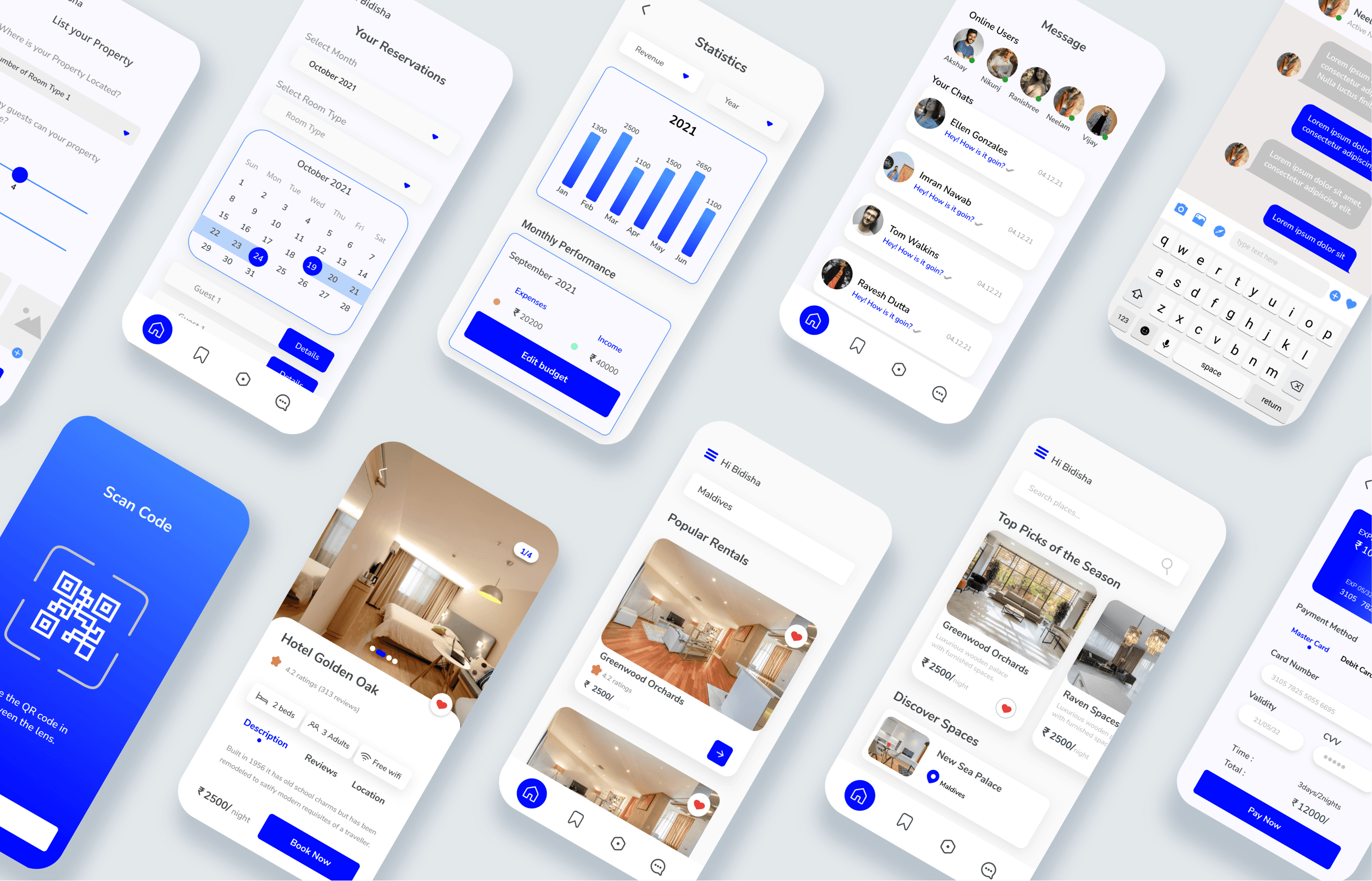
An app with a dedicated dashboard that will help non professional hosts manage their properties better and also add a level of personalized service, provide local recommendations, important info, and ensure that guests have a hassle-free, amazing stay.
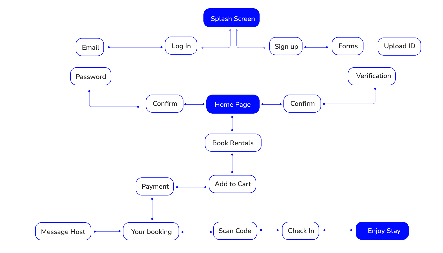
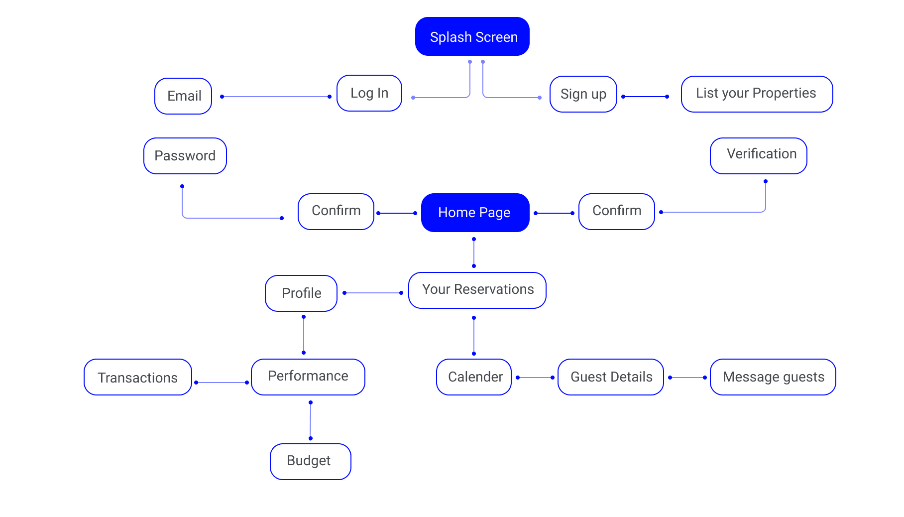
In the outline, the application allows users to check-in and check-out. To give a clearer idea of the flow in the application, here we give the picture below:
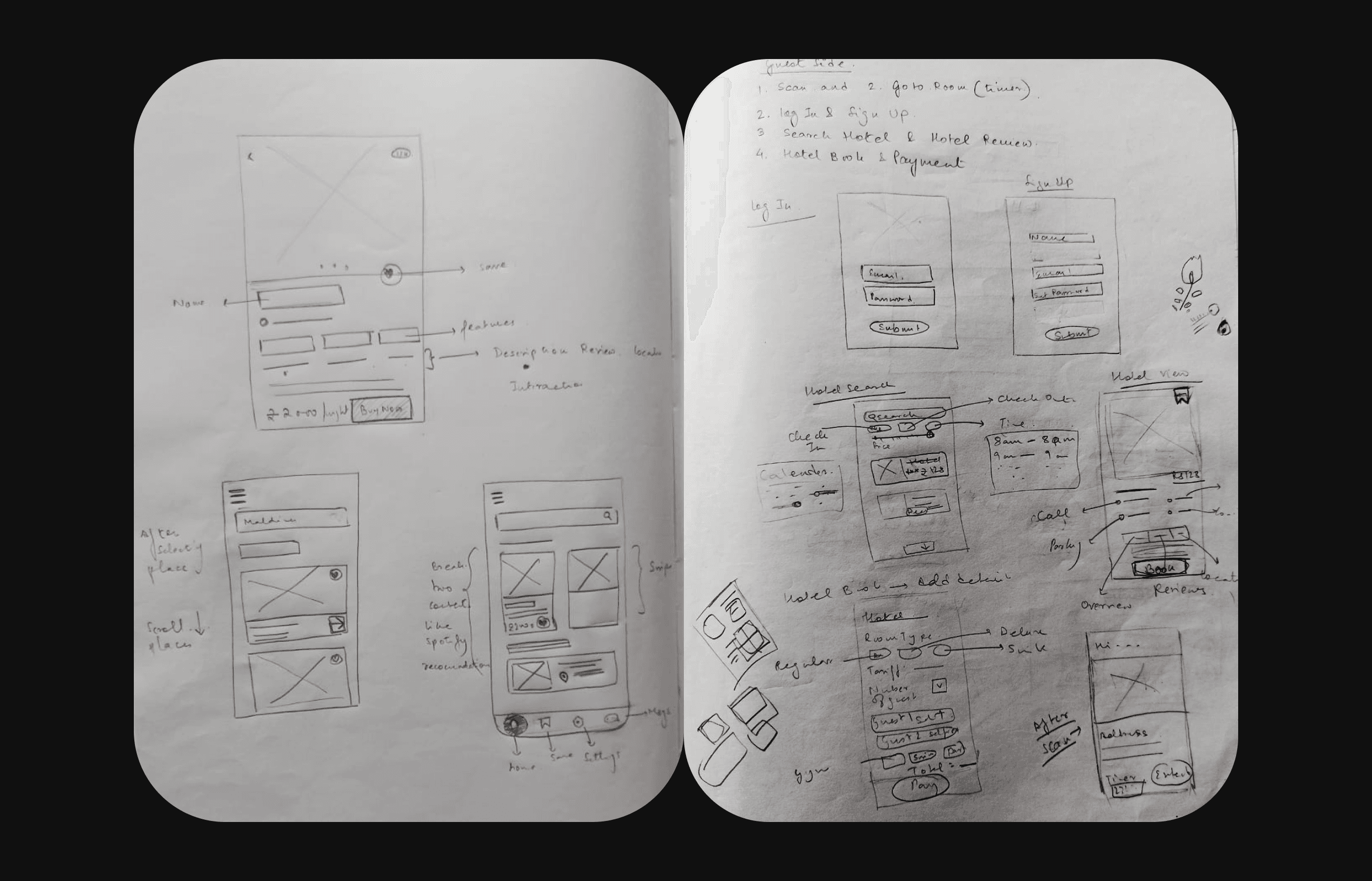
In this part, I will explain the details about the prototype and the reason behind the application. I started from Paper Prototypes that can comprehensively show the wireframes and the functionality of the application. They are simple layouts that are void of elegant UI; instead, they consist of scribbled lines that show the buttons, navigation, and other design elements of an application. In simple words, Wireframe is the Skeleton of UI based on the Design Principles and laws of UX.

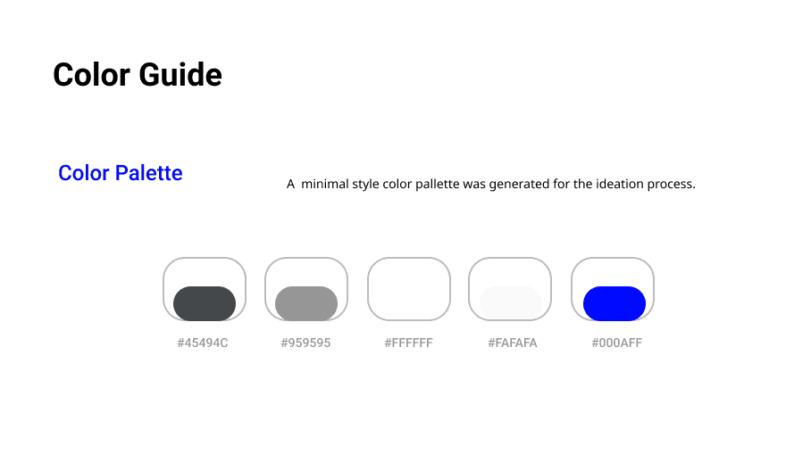
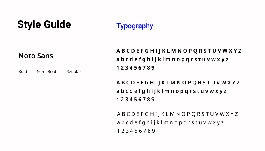
Before jumping into the visual design, I made an inspiration board consisting of a colour system and typography style guide. First of all, we created a visual style as a guideline that will later can be develop more comprehensively to be a design system:
Before proceeding onto the final interfaces , I throughly run a user test. I also create a further blueprint of a hi-fi prototype that enhances the most critical stage. That was a long document and now coming to the most awaited part of the design “How will my app look?” Don’t worry I got you, I have designed this app keeping in mind all the user demands and eliminating their problems. Some features are still not added to the design due to paucity of time but I have mentioned them in the article.
After working on the project for 4 weeks, learning about similar case studies and blogs , this was my take on it. Since the project was mainly done via desk researches, more input from user POV would had been better.
© Bidisha Sarkar 2023